The Nightmare of “Manual Server Checks”
When I first started my career, my biggest nightmare was night shifts. Whenever the system lagged, I had to open 15-20 Terminal windows simultaneously, SSH into each server, and run top, df -h, or free -m. At that time, it felt like “searching for a needle in a haystack” amidst a sea of fluctuating metrics without knowing the root cause.
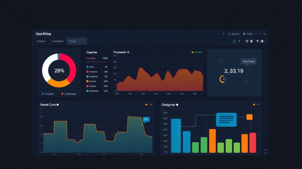
Later, after deploying Prometheus and Grafana, I realized I had been wasting far too much energy. Instead of manual commands, I now only need to look at a centralized screen to grasp the system’s health. However, installing Grafana is just the first step. To have a truly “pro” Dashboard that helps detect errors in seconds, you need design thinking and mastery of Variables or Annotations.
3 Pillars of an Effective Dashboard
Don’t turn your Dashboard into a battlefield with dozens of overlapping Graphs. After 5 years in operations, I’ve distilled 3 core “weapons” that make a Dashboard truly useful:
- Variables: Make your Dashboard flexible. You don’t need 50 Dashboards for 50 servers; just one, using variables to switch between them.
- Panels: Choosing the right Panel type (Gauge, Stat, Time Series) helps you read data 3 times faster.
- Annotations: This is the line between amateur and professional Dashboards. It marks events like: New code deployments, service restarts, or maintenance right on the chart.
1. Designing Variables: Never Hardcode Parameters
I once made a silly mistake: creating a chart for server A, then copying it to server B and manually editing the IP in the query. When the system scaled to 30-40 nodes, I was completely stuck.
The solution lies in Dashboard Settings -> Variables. Use the Query type to automatically fetch the server list from Prometheus:
label_values(node_cpu_seconds_total, instance)Then, replace the hardcoded IP with the $node variable in your queries. For example, to monitor CPU %:
100 - (avg by (instance) (irate(node_cpu_seconds_total{instance="$node",mode="idle"}[5m])) * 100)Now, a dropdown menu will appear at the top of the Dashboard. Whichever server you select, all the data below will automatically update. It’s fast, clean, and error-proof.
2. Choosing the Right Panel: Prioritize Observability
The golden rule: Critical metrics must be at the top, large, and clear.
Stat Panel (General Metrics)
Use this for Up/Down status or total Request counts. Don’t use a line graph if you just need to know if a server is alive. A large number with Green (Online) or Red (Offline) colors is enough to know the situation in a split second.
Gauge
Perfect for CPU, RAM, or Disk usage. When the needle points to the red zone (90% threshold), it creates a strong visual impact. You’ll know immediately if a server is “overloaded” without reading detailed numbers.
Time Series
Only use this when you need to see trends. For example: Traffic spikes at 8 PM or RAM leaks of about 200MB per hour. Pro tip: Enable Connect null values so the chart doesn’t break when data occasionally disconnects.
3. Annotations: The Answer to “Why Did It Fail?”
Imagine it’s 2 AM and CPU spikes to 95%; you’ll wonder: “Who did what?”. Annotations are the answer.
Every time I run a deployment script, I always include a cURL command to send a notification to Grafana. It creates a vertical line on the chart. Looking at it, I can see immediately: “Ah, CPU started rising right after deploying version 1.2”.
Here is a sample command to integrate into CI/CD (like Jenkins or GitLab Runner):
curl -X POST -H "Authorization: Bearer YOUR_API_KEY" \
-H "Content-Type: application/json" \
-d '{
  "dashboardUID":"your_id",
  "time":1649850000000,
  "text":"Deploy version 1.2 by ITFromZero",
  "tags":["deploy","production"]
}' http://your-grafana-url/api/annotations
Besides deployments, I also use Annotations to mark Database restarts or DDoS attacks. It’s like a visual operations log right on your Dashboard.
Dashboard Structure: Identify Issues in 3 Seconds
Don’t be messy. Divide your Dashboard into Rows in order of priority:
- Row 1 – Overview: Health status, Uptime, and average CPU/RAM of the entire Cluster.
- Row 2 – System Detail: Per-server details, Disk I/O, and Network traffic.
- Row 3 – App Metrics: API errors (Error rate > 5%), Latency, and order volume.
To save effort, you should use Library Panels. If you’ve configured a beautiful CPU chart, save it to the library to reuse in other Dashboards simply by dragging and dropping.
Conclusion
Building a Dashboard is like designing an airplane cockpit: the leaner it is, the lower the risk. Don’t try to cram everything in at once. Start with the most basic metrics, then gradually add Variables and Annotations based on real incidents you encounter. A Dashboard is not just colorful squares; it’s the eye that helps you control your system with confidence.